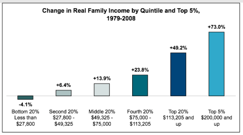
25 graphics showing upward redistribution of income and wealth in USA since 1979
February 25, 2011Leave a commentGo to comments
from David Ruccio
I assemble a presentation on inequality on a regular basis for my Principles of Microeconomics course. Here are links to the latest one, from Fall 2010, as a pdf document, a Powerpoint presentation, and a Quicktime movie.
The following are some other representations of inequality (please feel free to send me additional ones):
 source [ht: Magpie]
In the USA the already huge wealth gap between whites and non-whites is growing. (2 graphs)
In the USA the already huge wealth gap between whites and non-whites is growing. (2 graphs)
from David Ruccio
According to a new Pew Research Center analysis of data from the Federal Reserve’s Survey of Consumer Finances, the wealth gap between whites and non-whites has been growing during the current recovery: the wealth of white households was 13 times the median wealth of black households in 2013, compared with eight times the wealth in 2010, the wealth of white households is now more than 10 times the wealth of Hispanic households, compared with nine times the wealth in 2010.
The Pew Center notes that, leaving aside the apparently anomalous year of 1989,
the racial and ethnic wealth gaps in 2013 are at or about their highest levels observed in the 30 years for which we have data.
As it turns out, the share of total wealth owned by the top 3 percent continues to climb, setting a new record almost every year for the past two and a half decades—from 44.8 percent in 1989 through 51.8 percent in 2007 to 54.4 percent in 2013—while the wealth share of the bottom 90 percent fell—from 33.2 percent in 1989 to 24.7 percent in 2013.
That doesn’t leave much wealth for whites, blacks, and Hispanics to share, whether equitably or not.

